Translated by: Bayan Sobha.
according to Earth Journalism Network Please find the original text here
Maps are powerful tools for environmental journalists who want to tell compelling stories about the state of the planet and its resources; Maps can help visualize complex data, reveal spatial patterns and trends, and illustrate the geographic context of environmental issues; Read on to see some examples of how maps can be used as effective narrative tools; Maps can certainly be useful, but not all maps are equal, and choosing the right type of map for your story can make a big difference in how your audience understands and engages with your reporting.
This may seem difficult, but you really don't need to be a data journalist or a multimedia specialist to start incorporating meaningful maps into your narrative.
In this guide, we'll explain the different types of maps that can be created and explain how to choose the right map type for specific purposes; We'll also touch on interactivity and provide links to useful visualization tools as well as tips on what you can do to turn good data into a great map.
- Types of maps:
There are many types of maps that can be used in environmental and climate journalism, but here are some of the most common:
Basic maps:
These are the simpler maps that show the basic geographic features of an area, such as roads, rivers, cities, and borders; It can be used as a background layer for other types of maps, or as a standalone map to provide orientation and location information; For example, the map below appears from a story published in The Third Pole
The planned route of the Qosh Teba Canal, a controversial canal built by the Taliban in northern Afghanistan to divert water from the Amu Diriyah River for irrigation; The map is not interactive or very complex, but it serves the purpose of providing context and background to the story, in an area that many readers may not be familiar with.
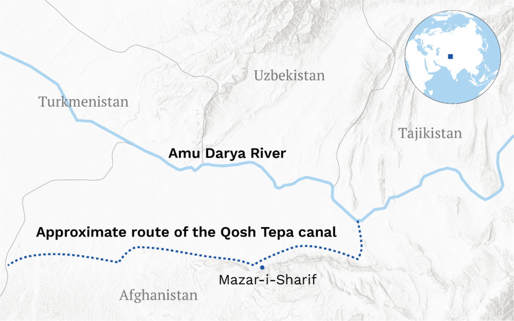
Plan of Qosh Tepa Canal/Source: The Third Pole.
Choropleth maps:
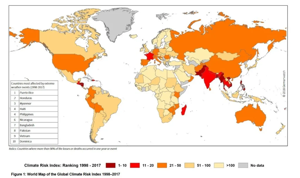
These maps use different colors or shades to show how a variable (e.g. population, income, pollution, etc.) varies across different geographic areas (e.g. countries, states, neighborhoods, etc.); They can be used to compare different areas or to show spatial patterns and trends; For example, the Chloroplyth map below from a story about the countries most vulnerable to climate change in The Third Pole allows for an easy assessment of which countries or regions are most affected.

Map of countries most at risk from climate change / Source: The Third Pole.
Dot Map:
These maps use dots or symbols to represent individual data points or events on the map. They can be used to show the distribution or intensity of a phenomenon (e.g. wildlife sightings, crime incidents, disease outbreaks, etc.) or to highlight specific locations or situations, for example, this story about wildlife tracking
Originally published by Mongabay with support from Earth Journalism Network (EJN), showing locations of illegal wildlife trade seizures in Southeast Asia in 2020. With dot maps, dot size has no meaning; If you want the size of an icon (eg a bubble) to express meaning according to its size, you should use a bubble map (see below).
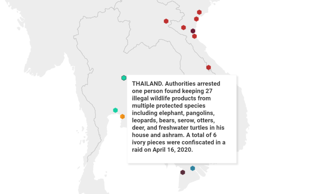
Map of locations of sources of illegal wildlife trade in Southeast Asia in 2020 / Source Mongabay.
Heat maps:
These are maps that use colors or gradients to display the intensity or frequency of a particular phenomenon (such as temperature, rainfall, traffic, etc.) on a map. They can be used to display hotspots or clusters of activity or to display changes over time; For example the heat map below from a story on reforestation originally published by The Conversation shows the concentration of tree cover around the world:
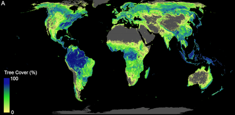
Map showing tree cover concentration around the world / Source: Crowther Lab via The Conversation.
Bubble Maps:
Also known as proportional symbol maps, these are a type of thematic map that uses circles or “bubbles” of different sizes to represent data associated with different locations or geographic areas. The size of each bubble corresponds to the amount of variable being represented. For example, in a bubble map showing population, a city with a larger population will be represented by a larger bubble than a city with a smaller population.
Bubble maps can be used to represent a wide range of data, from population statistics to economic indicators and environmental data. The visual nature of bubble maps makes them an effective tool for quickly conveying complex information, as readers can easily compare the relative sizes of bubbles.
The bubble map below shows that by 2032, there will be a total of 468 hydropower dams along the Mekong River and its tributaries, with twice today's capacity. Dam capacity (MW) is represented by the size of the bubble.
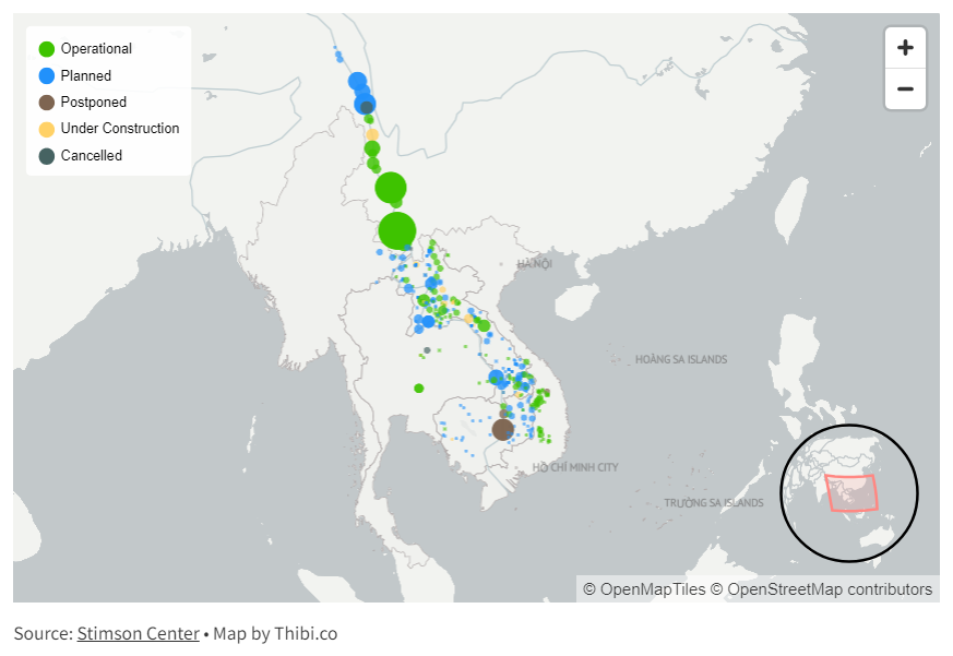
Map of hydropower dams along the Mekong River and its tributaries/Source: Thibi.co via Mekong Eye.
Flow charts:
A flow map represents the movement of objects, goods, people, or even information between different areas; These movements are usually represented by lines or arrows connecting different geographic locations. The thickness of the lines or arrows can indicate the size or size of the movement, and the direction of the arrows indicates the direction of flow.
Flow maps can be particularly useful for visually communicating complex environmental phenomena, such as tracking pollution, wildlife migration, resource distribution, and disease spread; In the context of health where the health of the environment, animals and humans are interconnected, for example, flow maps can show the spread of zoonotic diseases from animals to humans.
The flow map below is an example taken from a story about coffee exports from Vietnam in 2020 from mekong eye about coffee exports from Vietnam in 2020:
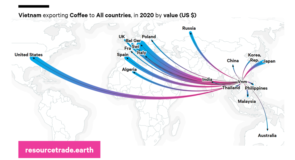
Map of Vietnam's coffee exports / Source: Mekong Eye.
Satellite images:
Satellite images, or satellite maps, provide a visual representation of the Earth's surface as seen from space; It can be considered a type of thematic map that presents spatial variations of a particular topic or topics, such as vegetation, land use, temperature, anthropogenic structures, etc.
It can be very useful to compare two satellite images taken from the same location but at different times, like the one below “The Hidden Environmental Burden of World Sand Mining” published by Yale Environment
360; Which shows the impact of sand mining on the water course connecting China's Poyang Lake and the Yangtze River over time.
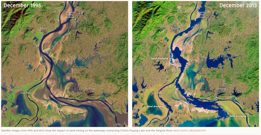
Satellite images show the impact of sand mining on the waterway linking China's Lake Poyang and the Yangtze River / Image source: Yale Environment 360.
Interactive maps:
Any type of map can be made more attractive and interactive for the reader by incorporating elements of interactivity, or interactivity. In online maps interactivity refers to the ability of a map to respond to user input, allowing the user to explore and manipulate the content of the map; They can include features such as zooming in and out, panning across different geographic areas, clicking on certain items to get more information, and changing the layers of information displayed on the map; There is a wide range of level of interactivity that an online map can provide; The School of Geosciences and Minerals at Pennsylvania State University explains this well: “Some maps allow only simple interactions such as panning or zooming in and out, or perhaps additional information about features appears when you move the mouse or click. Some can be developed for specialized users, and include the ability You can search, filter, and analyze data, as well as the option to upload your own user data for exploration and analysis.
– How to choose the appropriate map type
Choosing the right type of map for an environmental or climate story depends on several factors, including the nature of the story, the data available, and the main points the journalist wants to communicate to the audience; Here are some general guidelines:
Understanding the story: What is the main point or points in the story? Is it about a specific location or does it include a large region or even the entire globe? Is it about change over time or one point in time? Different types of maps lend themselves to different types of stories.
Consider the data: What kind of data is available for the story? Is it quantity or quality? Is it spatially distributed or concentrated in specific locations? The type of data available can greatly affect the type of map that can be created.
Think about the audience: Who will read or watch the story? What is their level of knowledge about the topic? What type of visual representation would be most useful to them? For example, the general public may benefit from a simple chloroplast map showing pollution levels in different areas, while a specialized audience may prefer a more complex flow map showing the movement of pollutants.
Experiment and review: Creating a story map is usually an interactive process; It can be helpful to create several different versions of the map, get feedback from others, and make revisions when needed.
Consider expert help: If a story involves complex data or requires a particularly sophisticated map, it may be worth working with a cartographer, a data visualization expert, or a geographic information systems (GIS) specialist.
Always remember, the goal of the map should be to help the audience understand the story better; If a map confuses or misleads the public, it is not doing its job. In this regard, it is also important for journalists to exercise caution to avoid distorting information; For example, using a large area to represent a small population can create a false impression of spread or control. To mitigate this, journalists must strive for accuracy of proportion and carefully consider the visual weight of plotted elements compared to their actual values or proportions. It is necessary to provide clear means of interpretation. , which helps the reader understand what the map represents.
What makes a map effective?
Clear and informative: The map must be able to present complex data in a simple and understandable way. It must provide accurate, relevant, and easy-to-understand information. The use of colors, scale, and other visual clues must be taken into account to make the data more understandable.
Interactive: The map should allow users to interact with the information presented as mentioned above. This can include zooming in and out, panning through the area, clicking on items to get more information, and perhaps even changing the layers of information displayed on the map. This allows users to explore the data in a That suits them and makes the content more attractive.
Localization: The map should allow users to see data at a local level, not just a global or regional level; This allows readers to understand the impact of environmental issues in their own area, making the story more relevant to them.
Time: Many environmental issues change over time, so it can be a good idea to let users see how conditions are evolving. This can be achieved through a time slider or other mechanisms that show different periods.
Accessibility: The map must be accessible to all users, including those with disabilities; This could mean making sure the map is readable for those who are color blind, or providing an alternative text description for those using screen readers.
Credibility: The data sources used in the map must be reliable and clearly indicated; This helps build trust with the reader and ensures that the map is a reliable source of information.
Aesthetic: Finally, the map should be visually attractive; This doesn't mean it has to be overly decorative, but it should be clean, well organized, and look professional.
Ultimately, what makes a good map a great map is not just about the data it presents, but how it displays that data.
- Useful planning tools:
There are many mapping tools available online (many of which are free or low-cost) that can help journalists create different types of maps for environmental stories. Here are some examples:
Google Earth: is a free tool that provides access to satellite images and 3D representations of the Earth's surface; It allows you to explore different locations, create custom maps and share them with others.
:Google Map
Provides access to road maps, satellite images, street maps, and 360-degree street views (Street View); It also provides route planning for travel on foot, car, bike, or using public transportation.
Flourish: A data visualization tool that offers a wide range of map templates, including point maps, bubble maps, coroblith maps, and even 3D maps; These versatility make it a useful tool for telling many types of spatial stories related to environmental issues, and one of the features of Flourish is its emphasis on interactivity.
Mapbox: This platform offers tools for designing and implementing custom maps, with capabilities to integrate maps with other data visualizations.
Datawrapper: This tool is widely used in journalism to create interactive maps and other data visualizations that can be included in web articles.
ArcGIS: A geographic information system (GIS) used to create and use maps, collect geographic data, analyze mapped information, and share and discover geographic information.
Tableau Public: is a data visualization program; Allowing you to create interactive maps and other types of visualizations, it is excellent for creating interactive maps that can be easily shared online.
QGIS: It is a free and open source GIS software that supports a wide range of data formats and provides a variety of tools for analyzing and visualizing spatial data. You can download it from their website.
Leaflet: is an open source JavaScript library for creating interactive maps. It is known for its flexibility and efficiency, and works well on desktop and mobile platforms.
Additional reading and additional resources:
https://inside.mediahack.co.za/mapping-for-journalists-9-essential-tools-in-2022-c01a5d133
https://gijn.org/2022/02/17/9-essential-mapping-tools-for-journalists-in-2022/
https://datajournalism.com/watch/mapping-for-journalists
https://www.journaliststoolbox.org/2023/05/25/mapping-and-geocoding-tools/
https://www.epa.gov/enviroatlas/enviroatlas-interactive-map
https://journalismcourses.org/course/mappingandgis/
https://newsinitiative.withgoogle.com/resources/trainings/storytelling-with-google-earth/
We hope this guide has given you some useful tips and resources on how to use maps effectively in environmental journalism. Maps are not just informational; They are also engaging and compelling tools for telling stories about our planet and the challenges it faces.
Use maps effectively!🌎
Now test your knowledge of maps by taking this quick quiz here Link